Tesla Model 3 Dashboard Redesign

Timeline My Role
Overall: 3 weeks UX Designer, UX Reseacher and Prototyper
Discovery & Research: 1 weeks
Design & testing: 2 weeks
Short intro
I’ve always been obsessed with Tesla’s UI, so I decided to recreate the Model 3 dashboard and play with ways to make it feel more immersive, cleaner, and easier to use while driving. This wasn’t a client job, just me experimenting, learning, and pushing my visual/UI skill set.
Why I Chose This Project
I’ve used Tesla’s interface before and I always wondered: “What if the dashboard felt a bit more like a gaming HUD — clear, atmospheric, and easier to navigate at a glance?”
I wanted to challenge myself with a project that blends automotive UI, real-time visual feedback, and dark-mode navigation.
Primary motivations:
I wanted to practice complex layouts
Improve clarity during driving
Explore a darker, moodier visual direction
Reimagine how music + navigation could coexist cleanly
Problem Framing
The main UX problems I wanted to explore:
Information Overlap
Tesla UI stacks navigation, vehicle status, and entertainment. It’s powerful but sometimes visually dense.Driver Glance Time
A driver has milliseconds to glance at the UI. Anything confusing increases cognitive load.Hierarchy Drift
Some Tesla screens place similar-weight elements next to each other, causing attention jumps.Mood + Atmosphere
Tesla’s UI is functional, but I wondered:
What if it felt more like a premium operating system?
Goals of the Redesign
My redesign focused on 4 improvements:
Cleaner hierarchy — give speed, lane positioning, and alerts clear priority
Reduced clutter — minimize distractions, simplify controls
Better coexistence of music + navigation
Stronger atmosphere — darker maps, glowy indicators, more “Tesla-like” personality
User Journey Snapshot

Scenario: A driver commuting in a Tesla Model 3.
Stages:
Start / Parked → Checks charge, opens trunk/frunk
Drive Begins → Adjusts climate, views lanes, speed, alerts
On the Road → Listens to music while navigating
Mid-drive Interaction → Quick access to controls & settings
Arrival / End of Trip → Parked charging view
Pain points I addressed:
Switching between music & maps without losing context
Fast access to climate and vehicle settings
Making speed + lane assist extremely readable
Reducing “screen overwhelm”
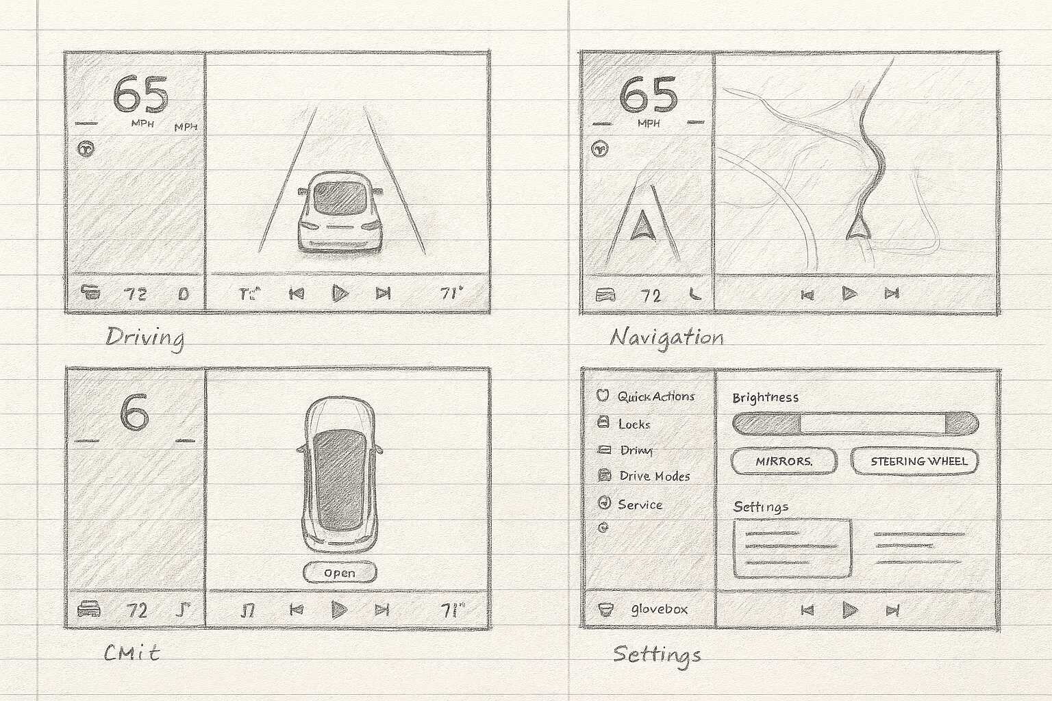
Lo-Fi Sketch
Design Principles
I centered the redesign around:
1. Glanceability
Use size, spacing, and contrast so drivers can see important info instantly.
2. Prioritized Attention
Speed, lane position, and alerts are the brightest objects.
3. Functional Darkness
Dark UI ≠ aesthetic only — it reduces eye strain, especially at night.
4. Minimal Motion
Animation should feel subtle, not distracting.
5. Context Awareness
Music playback adapts to drive vs parked states.
Final High-Fidelity Screens
Driving + Music Expanded
I made the lane-assist view bold and centered while letting the music section feel warm and immersive.
Driving + Navigation
The navigation dominates without fully hiding the driving view. The goal was to keep situational awareness strong.
Parked + Charging
Added a clean “electric systems” visualization that feels more like a premium OS.
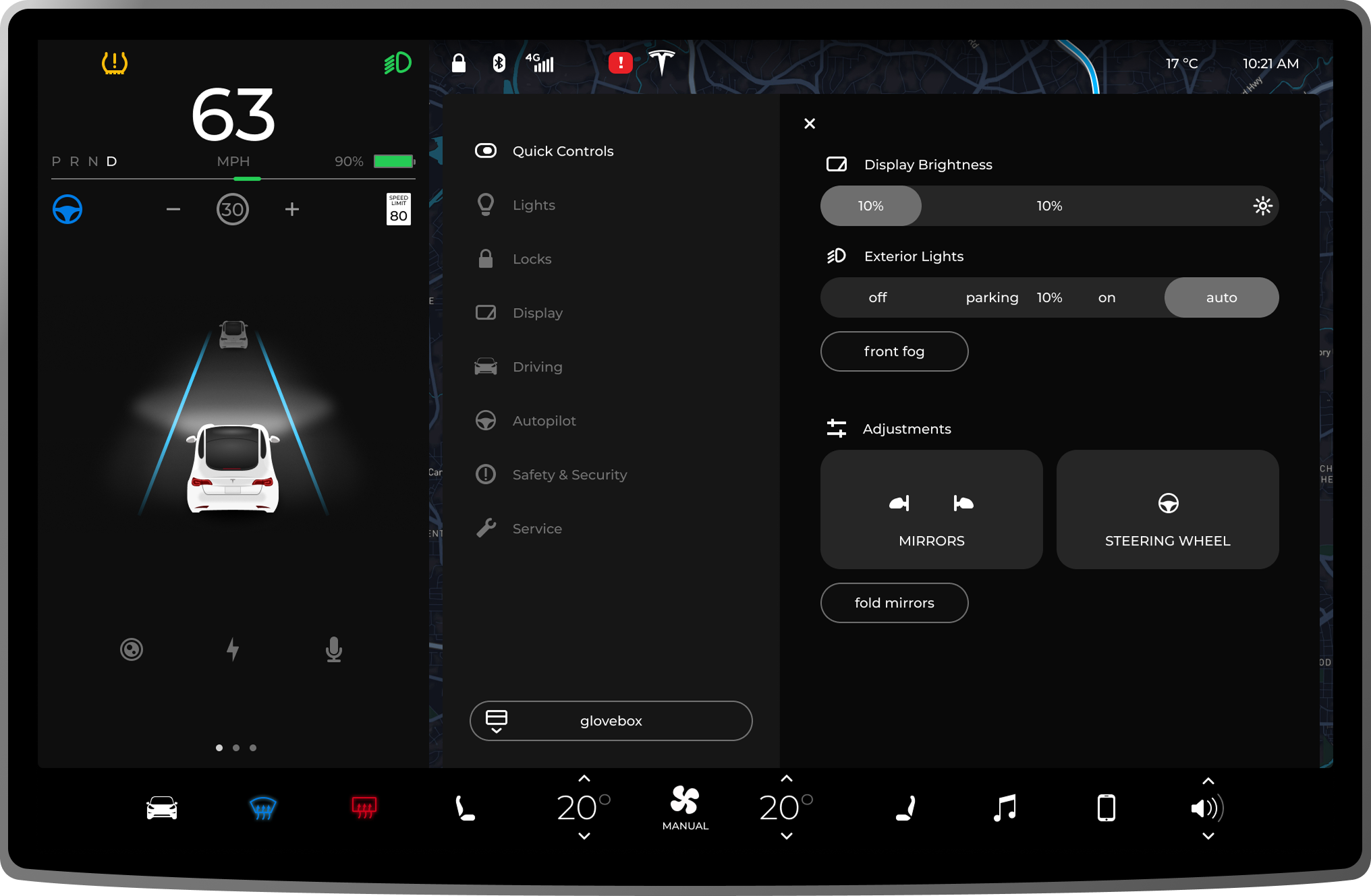
Quick Actions / Settings Panel
Rebuilt the settings drawer to feel softer while still Tesla-like.


Key Improvements I Made
1. Stronger visual hierarchy
Speed number and lane lines stand out more clearly.
2. Cleaner split screen layout
Music and navigation don’t fight each other.
3. Better contrast + readability
Dark blues, subtle gradients, and bolder icons improve glanceability.
4. Smarter bottom bar
Climate + audio controls sit on a floating bar, making the UI feel modular.
What I Learned
This project taught me how tricky automotive UI actually is. You can’t treat it like a normal app — every pixel affects safety. I learned a lot about balancing clarity with personality, and it pushed me to design more intentionally than usual.
Final Takeaway
I didn’t make this to “fix Tesla.” I made it to explore a system I love, challenge my design skills, and have something fun, futuristic, and thoughtful to add to my portfolio. This project helped me sharpen my high-fidelity UI skills while also practicing real UX reasoning.